Over the past six months, we’ve been on a transformative journey, enhancing the user experience and accessibility of Mentimeter. Join us as we explore the strides we've taken towards creating a more accessible and inclusive product.
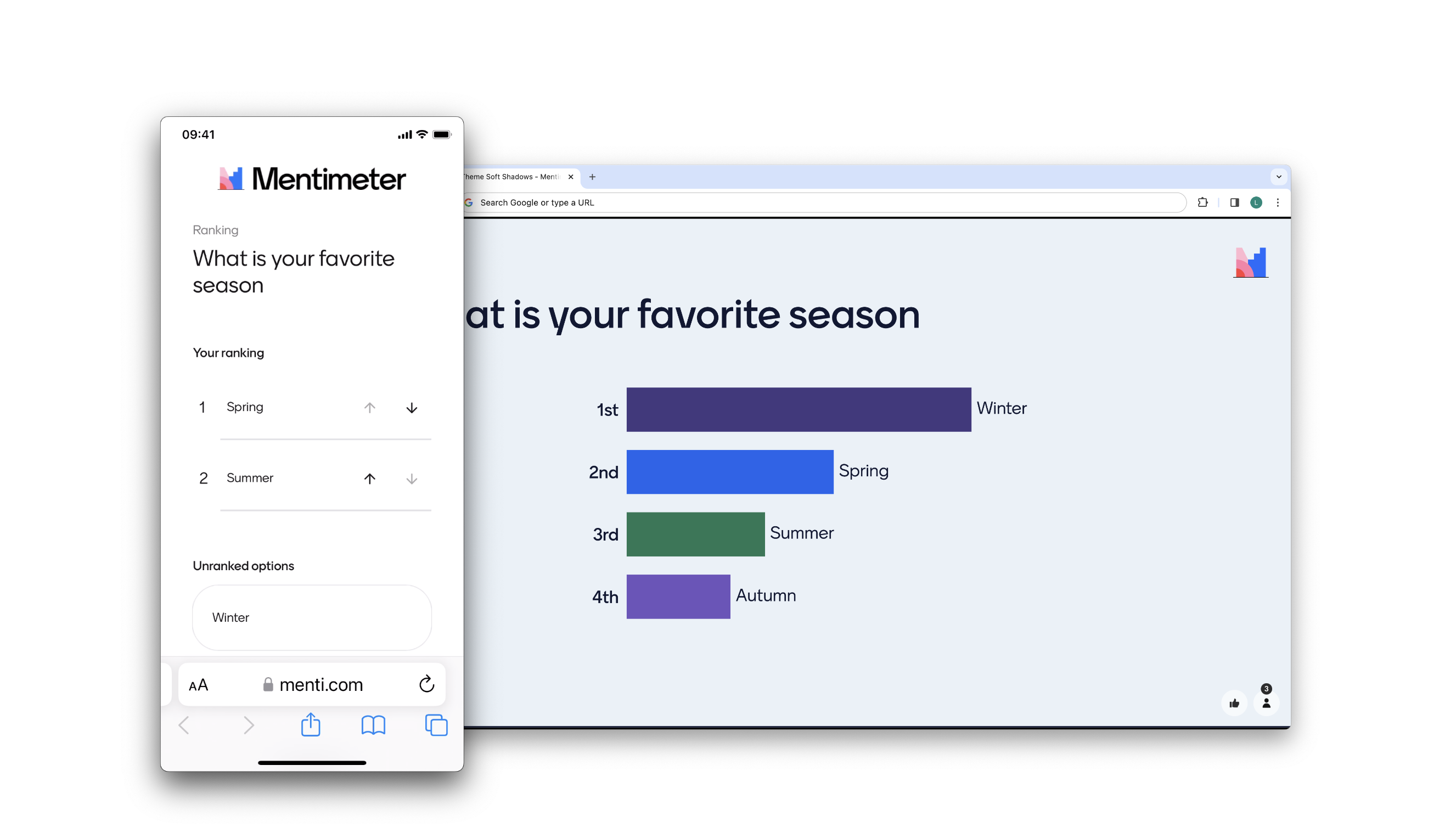
A new, more accessible Ranking
Through an accessibility audit and user testing, we learned that our popular question type ‘Ranking’ needed a lot of improvements. During the fall we released an updated version with a brand new user interface and added support for assistant tech like screen readers.
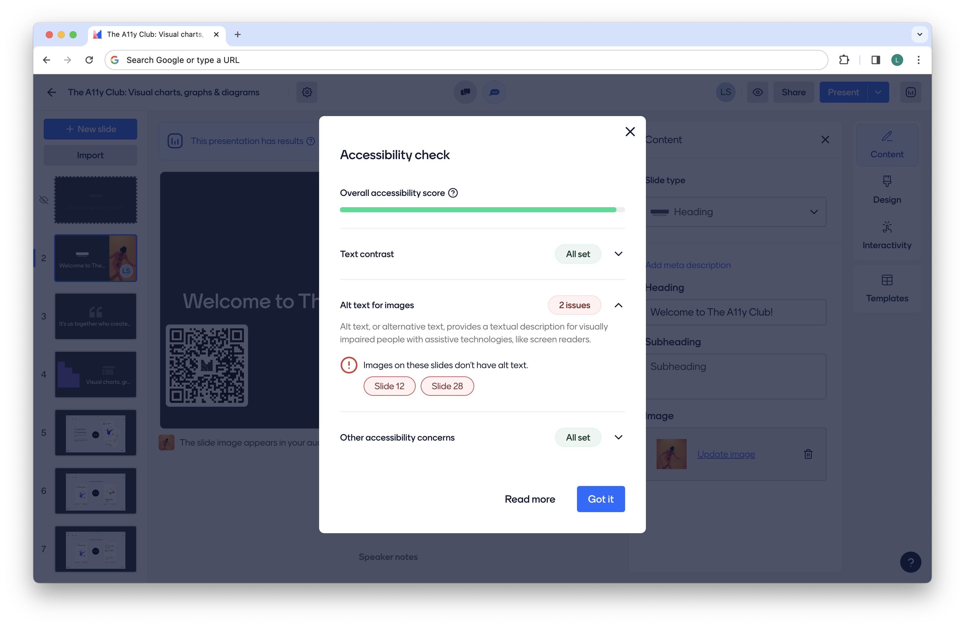
Introducing the Accessibility Check
To enhance the inclusivity of our presentations, we recently introduced an Accessibility Check to Mentimeter. This tool empowers users to review their content for potential accessibility issues, such as verifying the presence of alt-text for images and ensuring compliance with color contrast standards. By doing so, we enable users to create presentations that are visually engaging and meet accessibility standards.

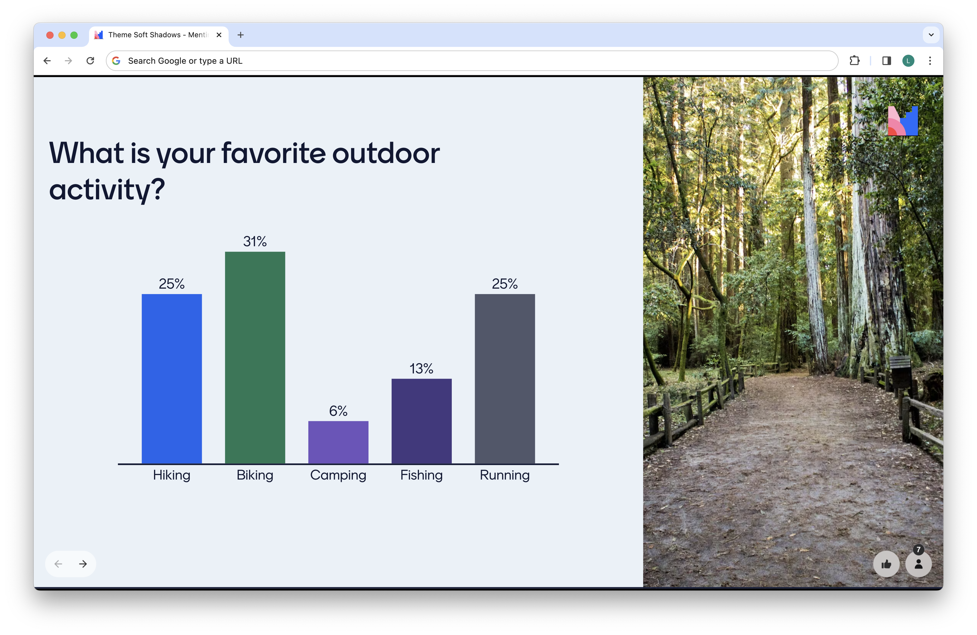
New themes for improved contrast
A couple of months ago, we rolled out the Soft Shadows theme in Mentimeter. This theme incorporates a palette with high-contrast colors, ensuring a visually striking presentation. Soft Shadows and Menti Dark are two standard themes that we recommend using due to clear typography and good contrast for text and interactive objects.

A new visual design language
As Mentimeter is evolving as a product, so is our visual design language. We’re making updates to how the product looks and feels based on the principles of feeling more human and simple.
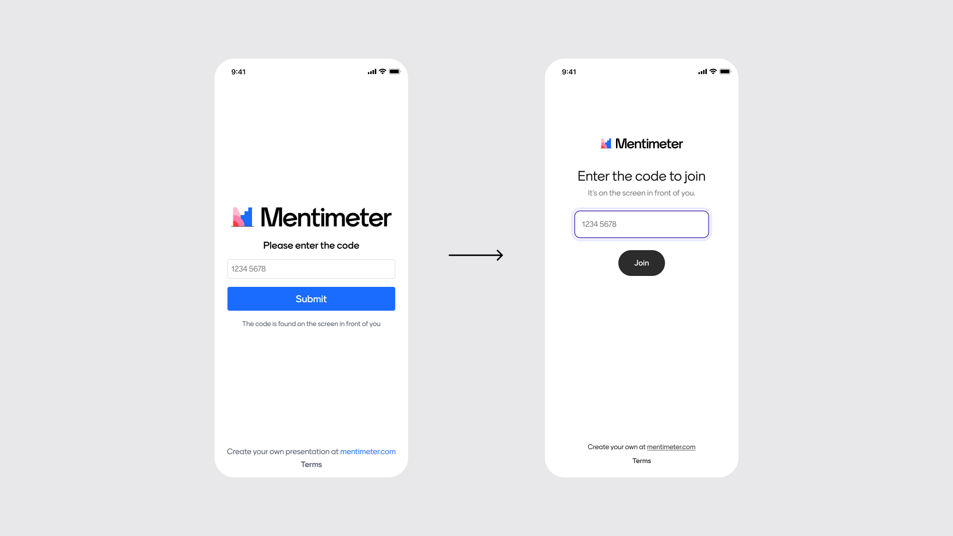
Before, a lot of elements were competing for attention, causing a cluttered user interface. In our new design language, we have a more deliberate use of spacing, size, and color, which makes Mentimeter feel less busy and easier to digest. We’re also committed to testing and evolving this new visual language to continually ensure the best possible experience for our users.

In this example, alongside the visual updates we’ve also clarified the instructions and button copy to make it easier for users to understand that they’re joining a Menti.
Under-the-hood improvements
In our current ongoing work supporting a new visual design language, significant improvements have been made to enhance keyboard navigation and the overall screen reader experience.
We’ve cleaned up the use of semantic HTML and aria attributes, thereby enhancing the experience for users who rely on assistive technologies. We’ve also established more consistent design patterns between different types of questions in our product, which makes it easier for users to know how to interact with them.
Enhanced language support
In a recent audit, we identified several opportunities to improve the way we translate instructions for screen readers. Our commitment is to maintain consistent instructions and tonality in our communication with screen readers, aligning with the overall Mentimeter experience.
We currently are prioritizing our most common languages and expanding language support accordingly. If you find that translations are lacking in your preferred language, we encourage you to reach out and give us feedback.
Ongoing commitment
We view accessibility as a fundamental aspect of creating a digital space that is welcoming and inclusive for everyone. These initiatives represent just a snapshot of our ongoing commitment to improving accessibility across our platform, with many more enhancements on the horizon.
As always, let us know if you have any questions or suggestions of improvements we can do from an accessible perspective. You can reach us at: support@mentimeter.com


