New Look; Same Menti
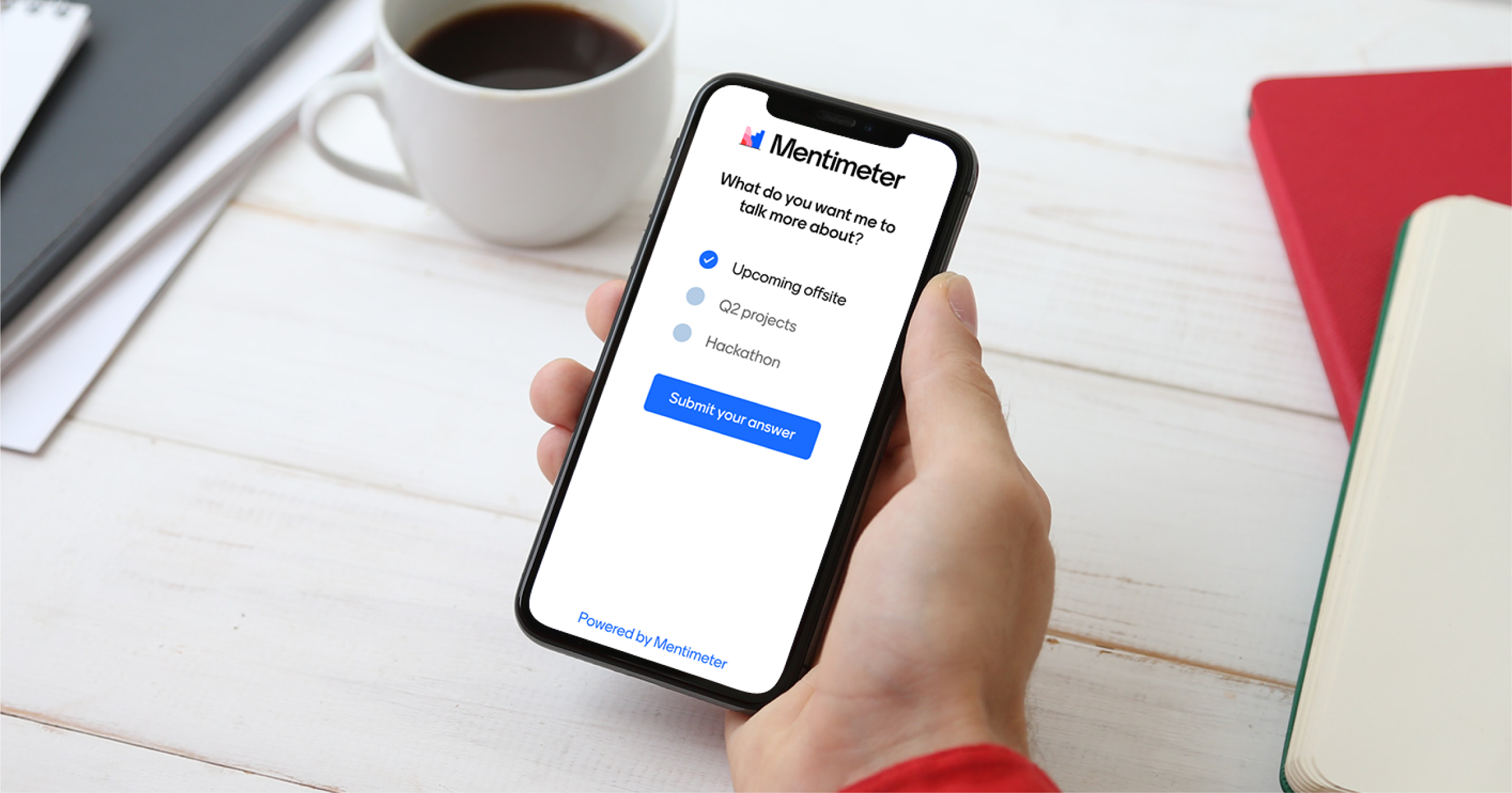
Today we are happy to share Mentimeter’s new brand identity with you, something that we have been working on for quite some time now. It’s super exciting (and also a bit nerve-racking, to be honest). We hope that you will enjoy our new look and feel just as much as we do!
Our new identity takes its visual cues from bars, pies, lines and dots; the most commonly used data graphics. They are the building blocks of a Menti experience. However, as you will recognize, doing a Menti is so much more than just visualizing data. It's the fun and excitement in the room, and the spirit of “Listen to be Heard''. By listening and allowing others to be heard, you create an inclusive environment that is unique for every individual Menti. With our new design, we are capturing some of that positive energy.
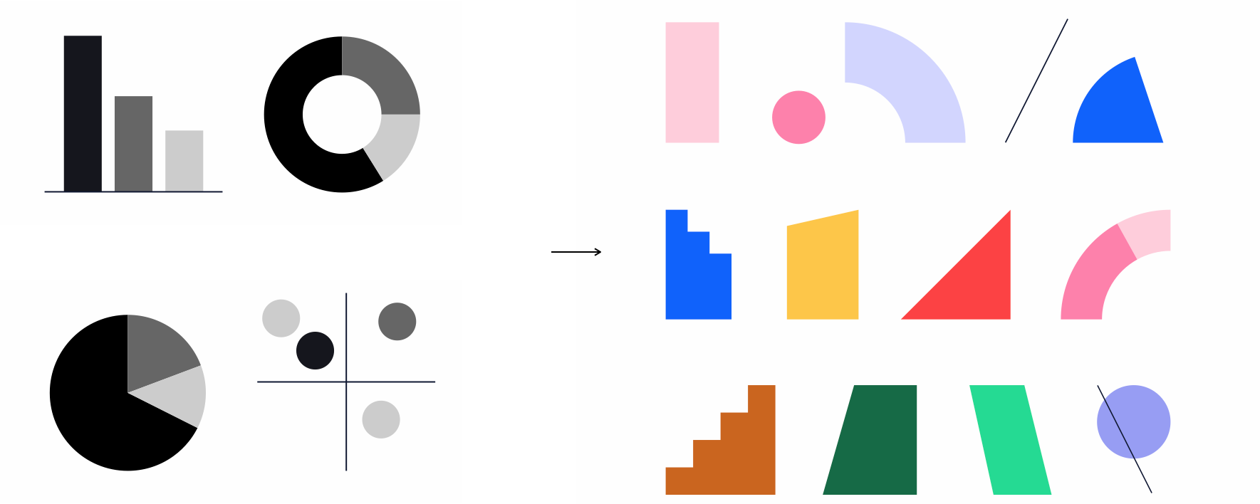
From data visualization to engaging and energizing shapes that create the foundation of the new identity
Our new logo
Our logotype combines the fun and seriousness that our users tell us makes Mentimeter so special. It is made from two elements, the Mentimeter symbol and wordmark.
The symbol is a playful take on well-known data visualizations. There’s our main symbol, but just like every Menti is unique, we’ve developed a family of ever-changing variations. And yes if you think the icon looks a bit like an M you get extra points.

Dynamic variations of the Menti symbol
Where our symbol expresses the fun and energy of Mentimeter, our wordmark represents the reliability and user-friendliness of our platform. Our logotype is the balance of fun and seriousness our users tell us makes Mentimeter special.
More than a logo
Our new logotype might be the most recognizable part of our new identity, but it’s just one part of a design system where every part is helping to create a unique experience.
All assets are created on a clear grid system, here new Brand Icons
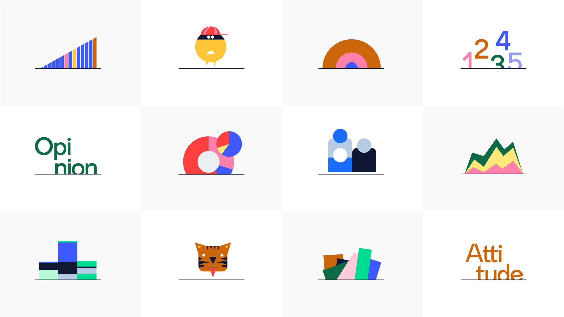
Examples of the Menti line
Menti Sans
As part of our identity, we have created a bespoke typeface called Menti Sans. With its quirky details, it is a subtle reference to the world of bar charts, without compromising on accessibility.
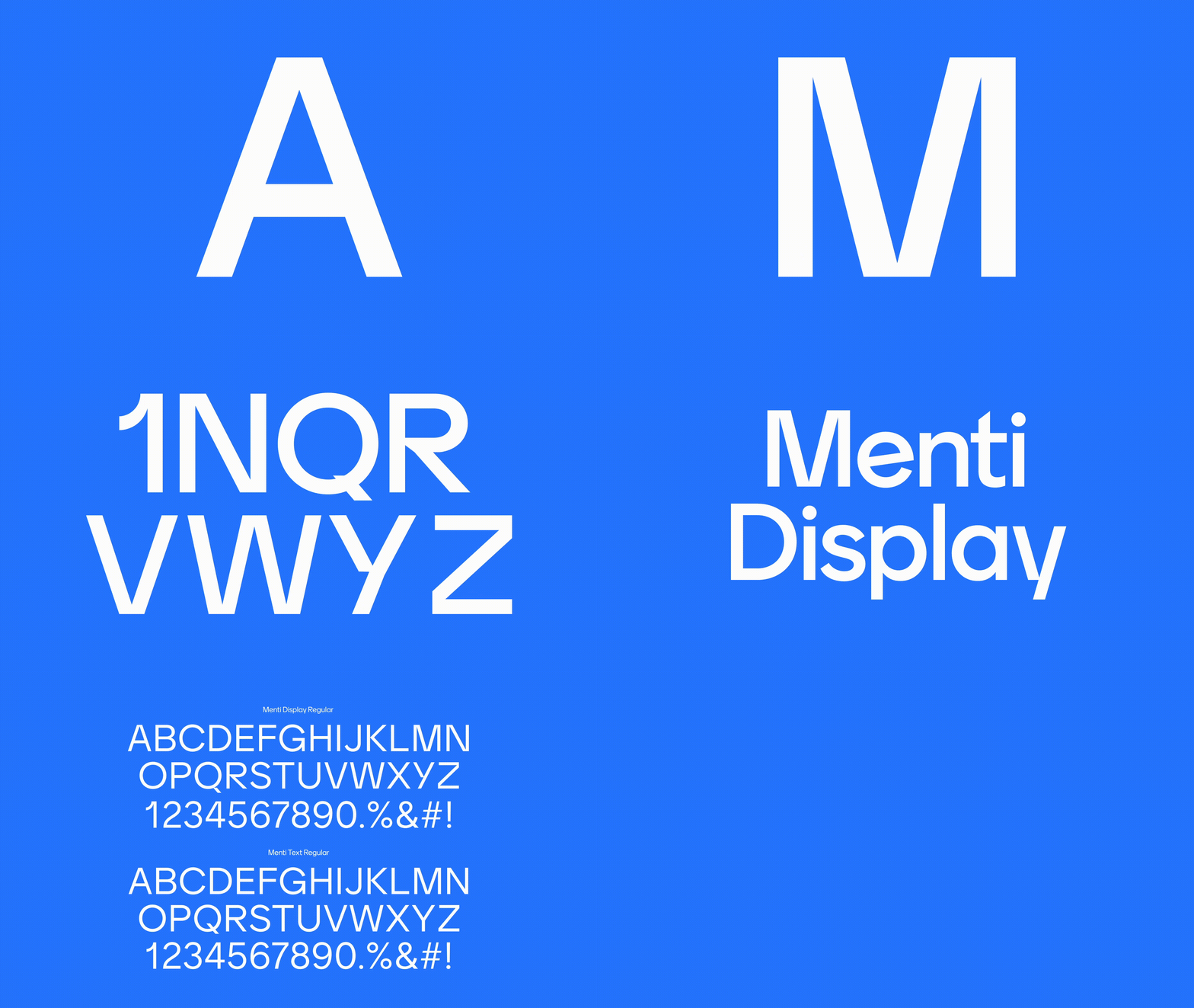
Blue, Black with a hint of Pink
You will still recognize us as a blue brand, but our colors have become more vibrant. Next to our new Menti Blue, our other primary colors Black and Pink help to create a distinctive Mentimeter look and feel.
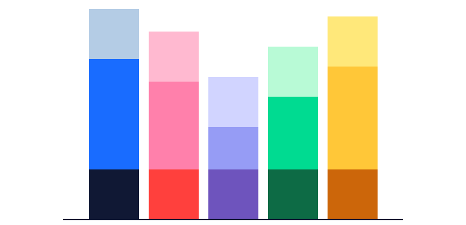
Our new more vibrant color palette
Stories of human relationships
We don’t see ourselves as just a tech company, but as a platform for enabling better human interactions. That’s why there’s a lot of room for stories in our new brand, which can be brought to life through genuine real-life photography, playful portraits or our new illustration style.
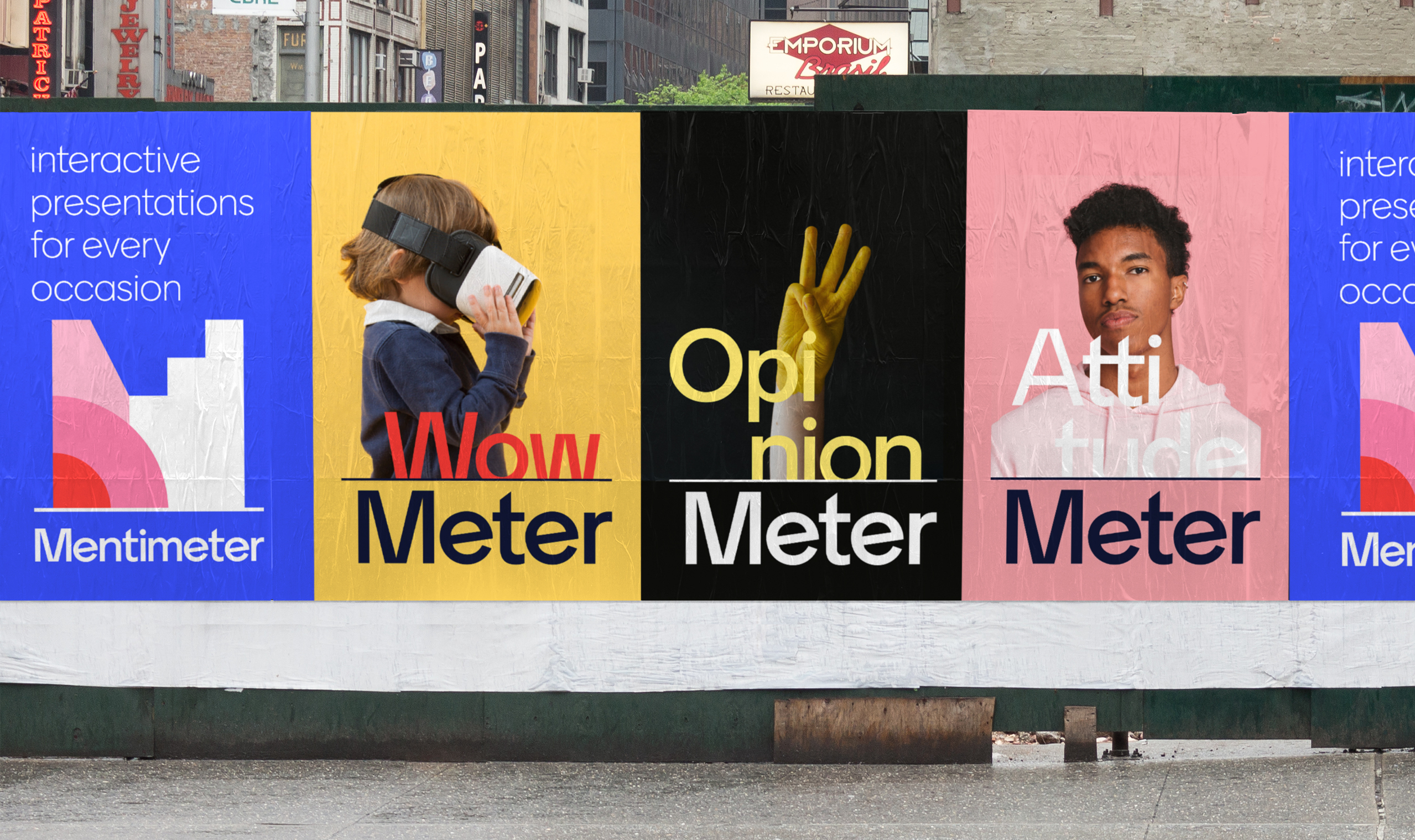
Communicating the uniqueness of each Menti experience
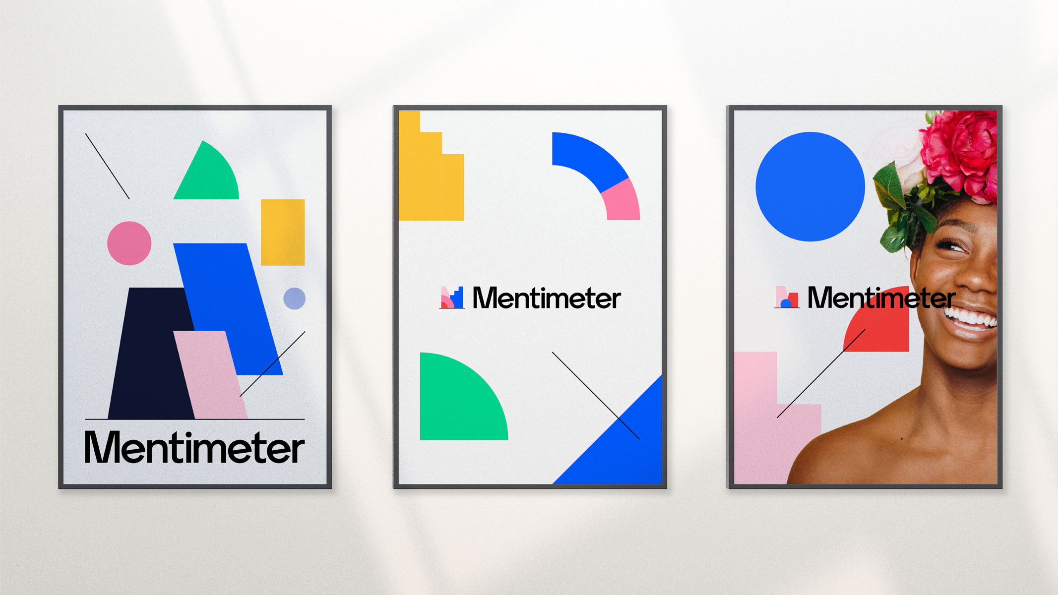
Selection of posters
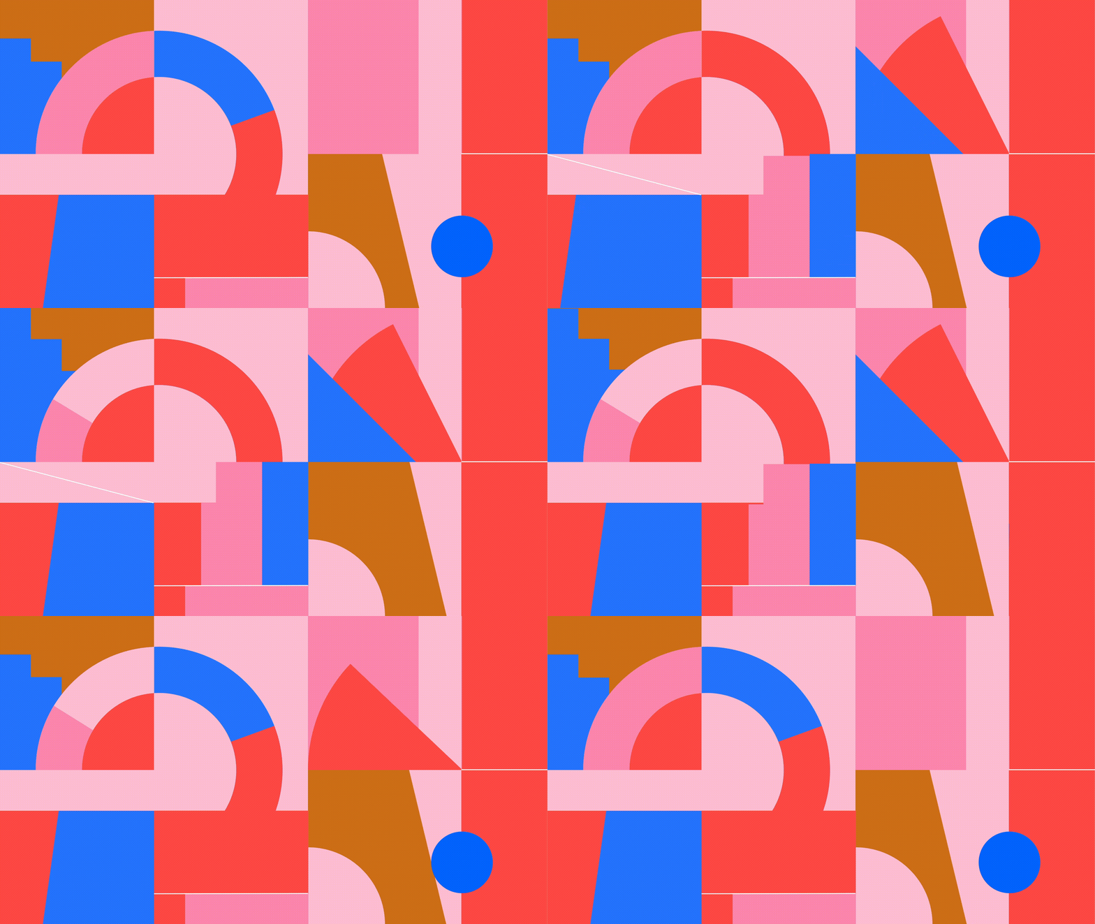
The Menti pattern
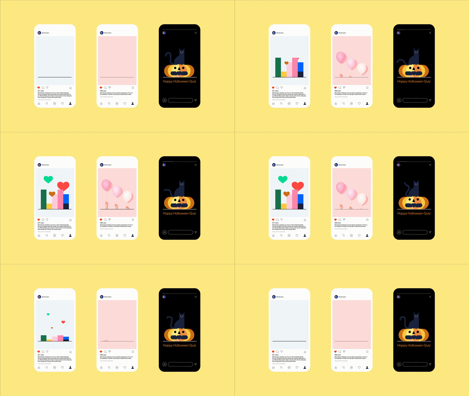
Social media content
Say hello to Kitty Meowington, Harry Head du Clouds and Bobby Burglar
This is only the beginning
Today we launch the identity not with a big bang, but like with all things we do, we will listen to learn and see what works and what perhaps does not. The new designs will roll out over time and even more exciting things will come your way. So watch this space, and let us know how you feel about the new brand.

Our new identity was developed in close collaboration with Bold Scandinavia and we want to send a big thank you to the team for their creativity, devotion and craft. Also a shout out to Letters from Sweden for creating Menti Sans.


