A More Accessible Experience

At Mentimeter we have increased our focus on accessibility, which has enabled great improvements for our users. We have more things coming as well, and we are glad to share these updates with you as we continue to improve the accessibility of our products.
Accessibility audit on our most common question types
One of Mentimeter’s core values is to include everyone, and for us, that also means that everyone should be able to make their voice heard through our product. This is why we conducted an accessibility audit on our voting experience, targeted toward the most common question types. The audit was combined with user testing with people with disabilities to better understand what needs improvement.
The insights from the audit and the user test lead to a lot of awareness of what needs to prioritize. This, for example, has led to a significant improvement for one of the most common question types that we are working on right now.
An insight that became more clear to us is that we also need your help as a presenter to make an inclusive presentation to your audience. That's why we have updated our guidelines about Present with accessibility and inclusion in mind
Support for enlarged text
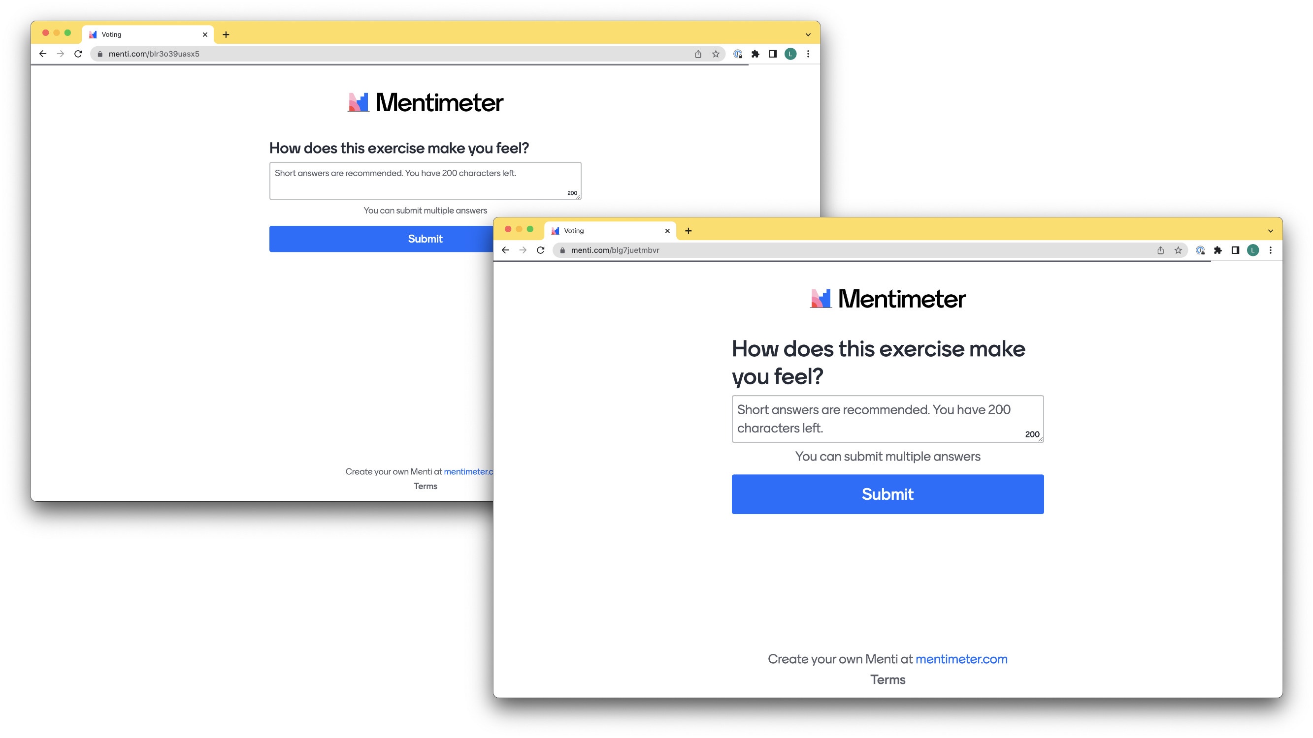
To make it easier for people with visual impairments, we now use REM to define the size of the text at menti.com. Using REM to define the text makes it possible for our users to increase or decrease the text size in their browsers. This will benefit users with low vision or users that prefer a larger text size for readability.

A new modal
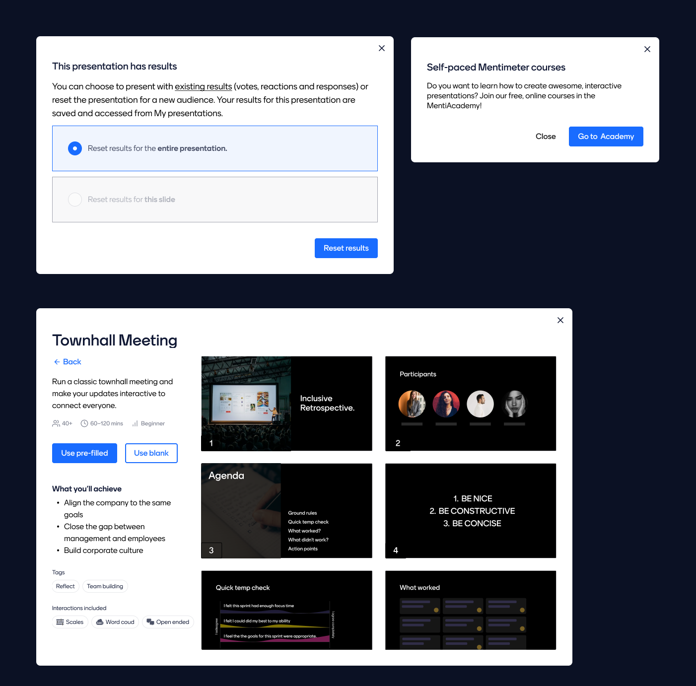
Modals, pop-ups, overlays, or what you prefer to call them, often have accessibility issues. We have created a new one in our Design System Ragnar that works great with assistive tech and means that we use modals more consistently.

Improvements in the editor
In our editor, where you create your presentations, we have made improvements to better support keyboard navigation and assistant tech. The editor has also implemented the opportunity for enlarged large text.
Ragnar
We have also conducted an accessibility audit on Ragnar, our design system for Mentimeter. Most of the issues we found have been improved, and this will benefit assistant tech like screen readers so the user experience gets better. The lovely thing about our design system is that the improvements trickle down in all Mentimeters products.
Suggestions for improvements
Thanks to all input we get from you, we now have a better understanding of what our customers expect from us. We have analyzed all the questions we have received about accessibility in recent years to give us a better view of what is important for you.
If you have any suggestions for improvements or questions within the accessibility field, please send us an email at hello@mentimeter.com
More to come
And talking about going in the right direction, we are right now working on a new Color Framework that will make it easier to work with color contrast. This enables our designers and teams to have a more accessible color palette at their disposal.
We are also working on implementing an accessibility checker in the editor to enable our presenters to create more accessible presentations.


